If you’ve been following the advice laid out in this chapter, you would have, at this point, created a master resume and a draft of your tailored resume. You might think of the job application process as like being in a reality show cooking competition. The master resume is like your pantry—it contains all the ingredients you might use to cook any meal you’re capable of cooking. It contains much more than will ever go on a single plate, and, while it is arranged logically for convenience, no one but you ever sees it. Likewise, your master resume includes all the things you might ever use in a resume, cover letter, or an interview. It’s arranged logically for your convenience, but it isn’t formatted beautifully or anything, since no one will see it but you.
The judges in the competition are like your potential employers. In both cases, you want to provide what you know they want, because that gives you the best chance of winning. On a reality cooking competition, you would watch previous seasons of the show to get a sense for what each judge loves and hates, what their hang-ups are and what impresses them. In real life, you carefully analyze a job ad to guess at what the employer is looking for in a new employee.
With your pantry prepared and a sense of each judge’s tastes, you are now ready to cook a dish that will knock their socks off and win the show. In real terms, you create a tailored resume and cover letter that argue convincingly that you are worth interviewing for the position. That dish—or that tailored resume—includes a carefully curated fraction of what is in your pantry, only the best of the best for the judges at hand. Just as you don’t want them filling up on bread and water before they get a chance to sample your filet mignon and caramelized carrots, you don’t want to stuff your resume with empty calories. You know that you have only one quick bite with the judges—a few seconds of skimming with the employer—to show them who you are, so you make sure their first bite is the best bite.
If you’ve ever watched a cooking competition, you know that the taste of that bite is only part of the equation—the meal has to look like a million bucks too. In resume terms, this means formatting.
Let me clear about this point. The resume’s formatting alone cannot win you an interview—that’s the content’s job. But it can lose you an interview if it’s bad or ineffective. In food terms, I’m saying that a great-looking cake that tastes like garbage won’t impress anyone. Also, a cake that looks like garbage might taste great, but no one will ever know if they are unwilling to put it in their mouths.
So with this in mind, let me present and explain the three goals we should have in mind for our resume formatting. We are trying to create resumes that are
- Readable
- Scannable
- Aesthetically Pleasing
Readable
Readability is the easiest of these goals to achieve. All I mean is that you choose nice fonts (nothing too weird or graphic) that are easy on the eyes, use them in font sizes that most human eyes can decipher without a magnifying glass, and not cram the page with so much text that it becomes onerous. It’s also good to use reasonable spacing between lines (don’t cram things together too tightly) and to avoid having long lines of small text stretching margin to margin—the human eye has trouble staying on the right line when they stretch too far.°
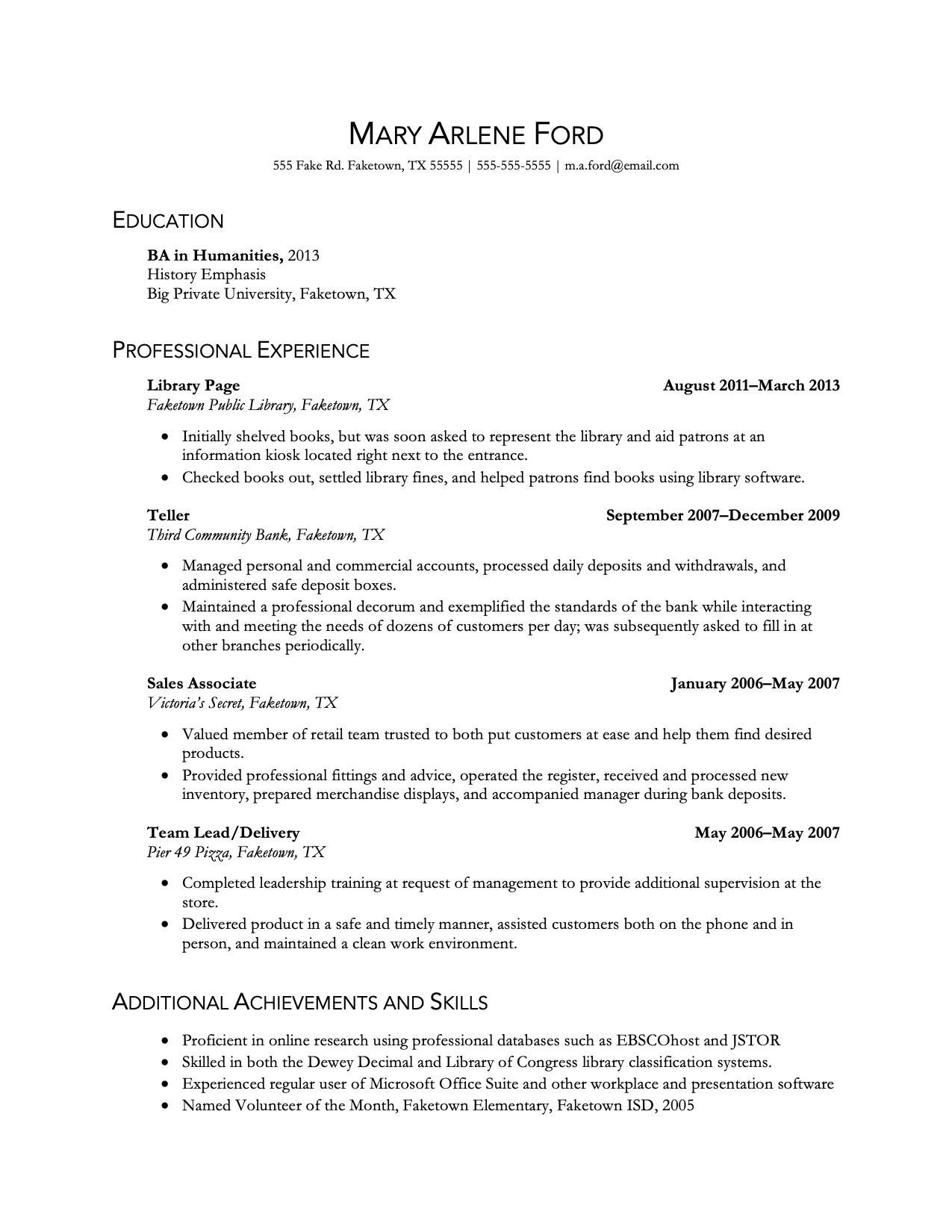
Throughout this article I'll be using the following resume as an example. This is the real resume of a recent college graduate (identifying information has been changed).
Scannable
Scannability is a little more complex, and it’s the most important of the three. The thing to remember is that resumes aren’t read the same way as novels or textbooks. With those, the reader starts at the top left and then reads each line in order, down the page, skipping nothing.
With a resume, however, readers read in tiers:
- First they look at the top-tier of information, which comprises the headers dividing the resume into major sections.
- From there, they might dive into a section to the next layer of information, for example, by scanning the first lines of each job entry.
- If one catches their eye, they dive down another layer, looking at the details about a specific job. Or they could back up a level, head to another section, and dive in there.
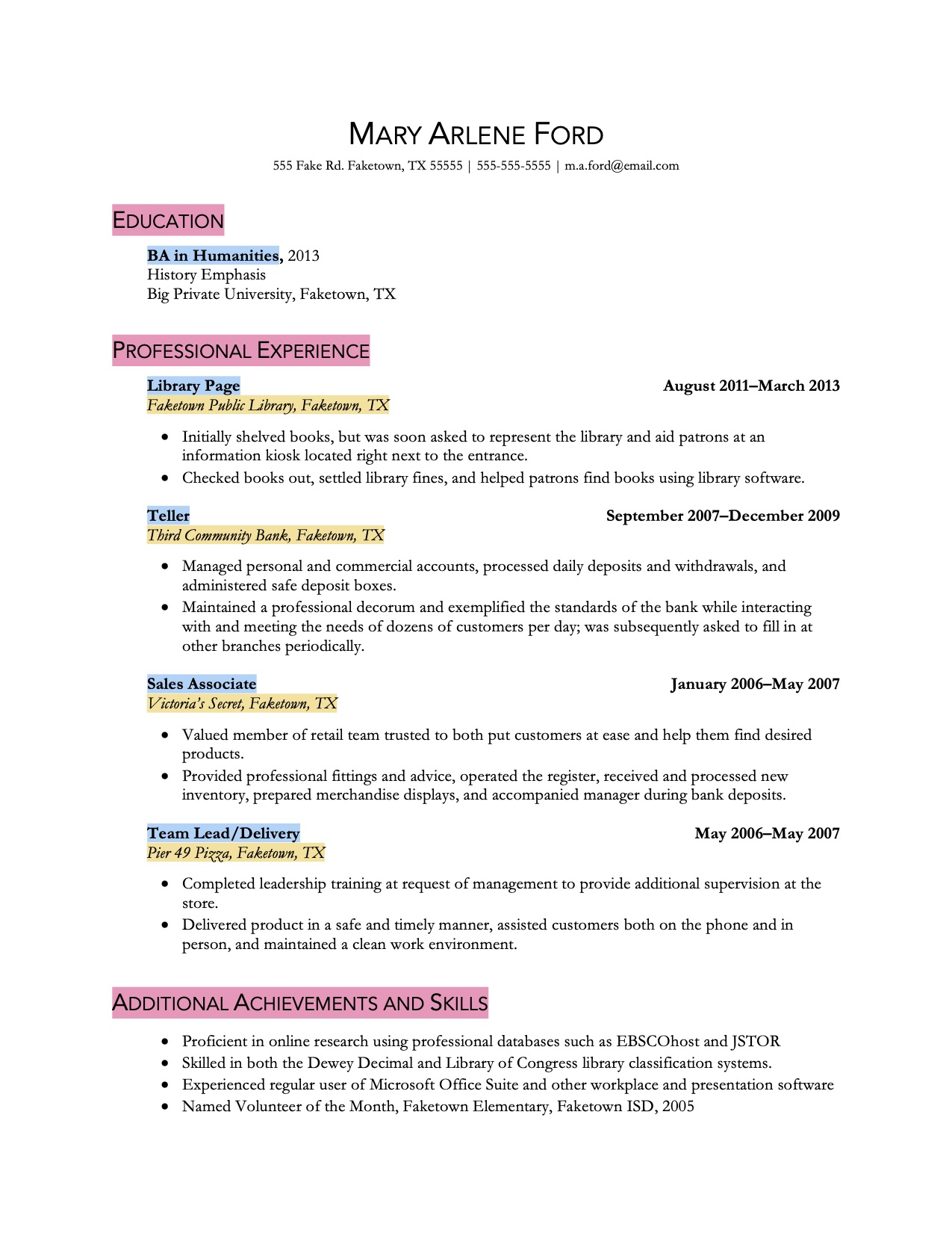
Mary's resume with the tiers highlighted. Level 1 is pink, level 2 blue, and level 3 is yellow. The bulleted information would constitute level 4.
The knowledge that readers scan quickly, moving up and down the layers of the document, prompts us to accommodate that reading style by clearly signaling the hierarchy of information with our typographic choices. Generally speaking, the higher the tier of information, the more prominent the text should appear, like how formal outlines use Roman numerals for the top level of organization, then capital letters, then Arabic numerals, then lowercase letters, and so on, each successive tier diminishing in impact.
You can see in Mary's resume above that the level-1 information is in a different font than lower levels and is at a larger size and rendered in small caps. It's also the only text touching the left margin, as all lower-tier entries are indented. The level-2 info is bolded to make it visually weightier than the info below it, and the level-3 lines are italicized to minimize their impact, since they contain relatively unimportant information.
Anticipating the Reader's Eye
We know that, when scanning or skimming, readers’ eyes tend to move down the left margin looking for interesting works and phrases, so we should put our best words in their path. The first two or three words of any bullets should be powerful, evocative, and as specific as possible to pull the reader’s eye out of scanning-mode and into reading-mode, tempting them to read the entire bullet before moving on.
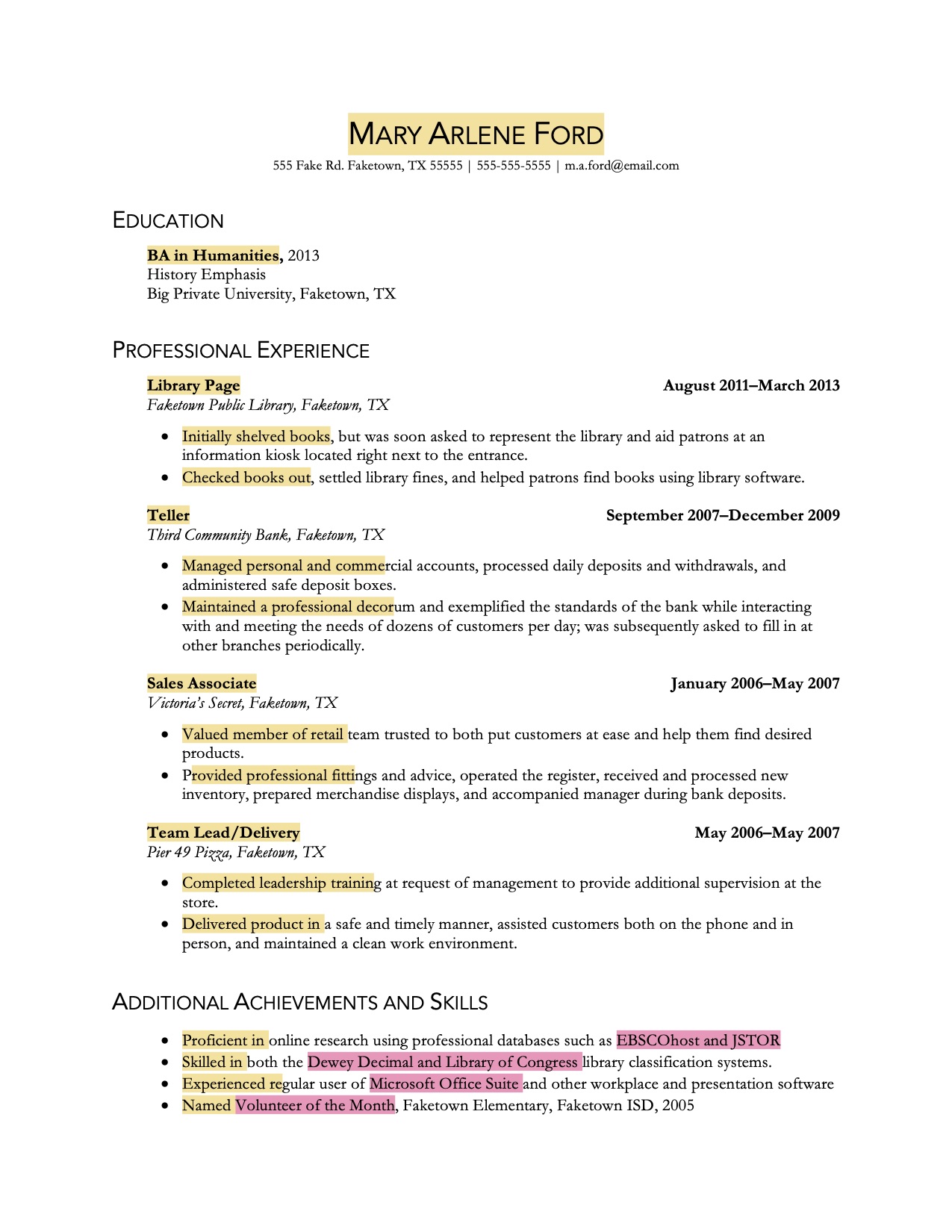
The yellow highlights show what words and phrases the reader is most likely to read when scanning quickly down the page. The pink highlighting shows how capitalized words such as proper nouns can pull the reader's eye down the line.
While Mary's resume does use strong, interesting words to start out each bullet point, her resume would be more effective if these openings were carefully tailored to express the must-haves and nice-to-haves that she knows the employer is looking for.
Aesthetically Pleasing
The last goal is that we create a document that is aesthetically pleasing. We do this for the same reason we dress nicely for a date or a job interview—because, whether we like it or not, people judge books by their covers. A resume that looks unbalanced, scruffy, or jagged implies, rightly or wrongly, that the writer of the resume is similarly unbalanced, scruffy, or jagged.
Here are some quick tips about what to strive for aesthetically.
Balance
Documents look best when the text is evenly distributed across the page. If you fold a page in half vertically, the visual weight of the words on the left half should be roughly equal to those on the right half.
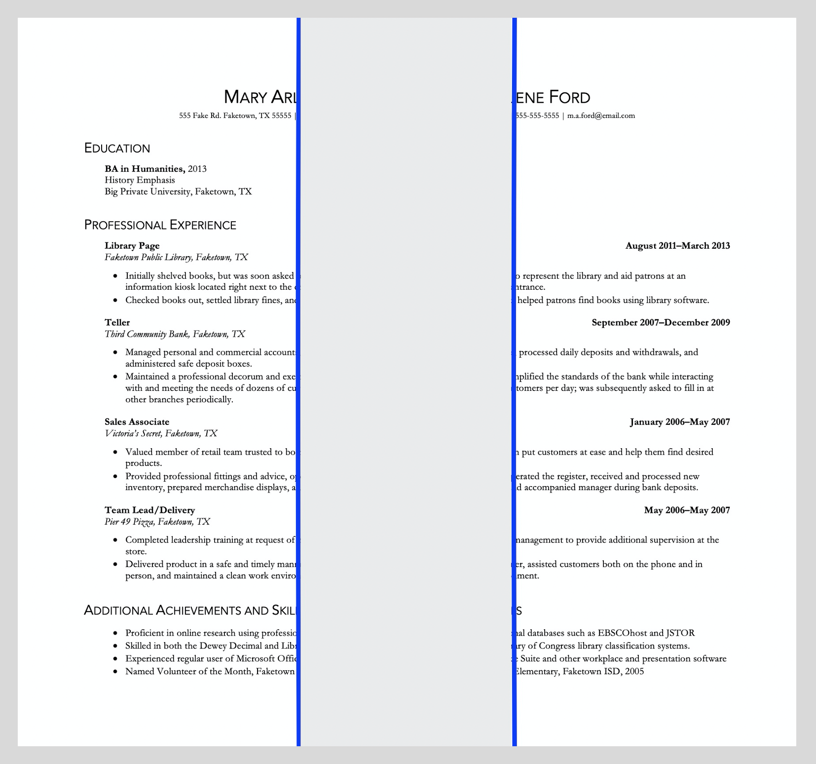
Notice that Mary put the dates of her employment in bold, even though such information isn't very important, relatively speaking. The reason was less to highlight the info and more to help balance out the page.
This can be a bit hard to achieve since every line will start at the left margin but not all will reach the right margin, so don’t freak out if the balance isn’t absolutely exact—readers are used to the left sides of pages being slightly denser and heavier than the right sides.
A few common tricks to help balance the page include the following:
- using columns to create parallel blocks of text distributed across the page
- aligning less important information like dates along the right margin
- indenting lower-tier information so that it doesn’t touch the left margin
- using full-width horizontal rules to divide sections
Similarly, each quadrant of the page should be roughly equal in weight. The top right quadrant is often the toughest to fill, which helps explain why so many resumes center the name and contact info or put the writer’s high school and college degrees next to each other in columns.
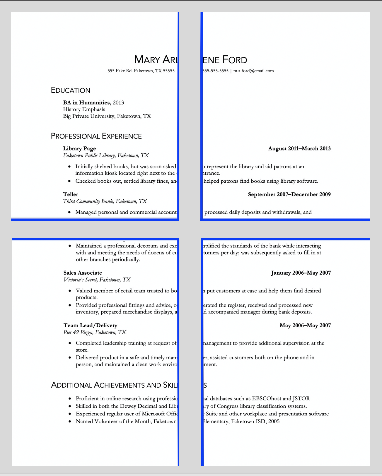
Mary didn't finish high school (skipping instead to community college before transferring to a four-year university), so she can't fill in that top right quadrant with a diploma entry.
White Space
Documents need empty areas to balance out areas dense with text.
The most important white space is around the edges of the page in the margins; these are typically one inch all around, but that’s not the only option. I find that a resume with more text to fit can shrink the margins to .7 or .8 inches and still feel airy enough.° Similarly, you can usually expand the margins to 1.2 or 1.3 inches without things appearing too empty.
There needs to be white space between sections on the resume so that the reader senses visually the separation of information into tiers, as discussed above. I find that a bit more space between sections that between entries within a section looks right to me (as on Mary's resume), but keep two things in mind:
- The spacing between sections should be consistent across the document—if there’s 18 points of space between Education and Work Experience, there should be that same amount between Work Experience and Skills, or whatever.
- White space isn’t the only way to achieve visual separation; you could also use a font’s size, style, or weight, horizontal rules, or indenting to signal shifts to the reader without sacrificing needed space.°
Personality
Lastly (and least important, really), your resume should convey some of your personality in the font choice and layout. Scientists and engineers often gravitate toward sans serif fonts because the clean look reflects their analytical, no nonsense approach to their work. Humanities majors tend to favor serif fonts, perhaps because most books are set in them and thus such fonts reflect their bookish personalities.
Mary opted for two fonts—a sans serif called Avenir for the headings, and the very bookish serif font Garamond for the main text.
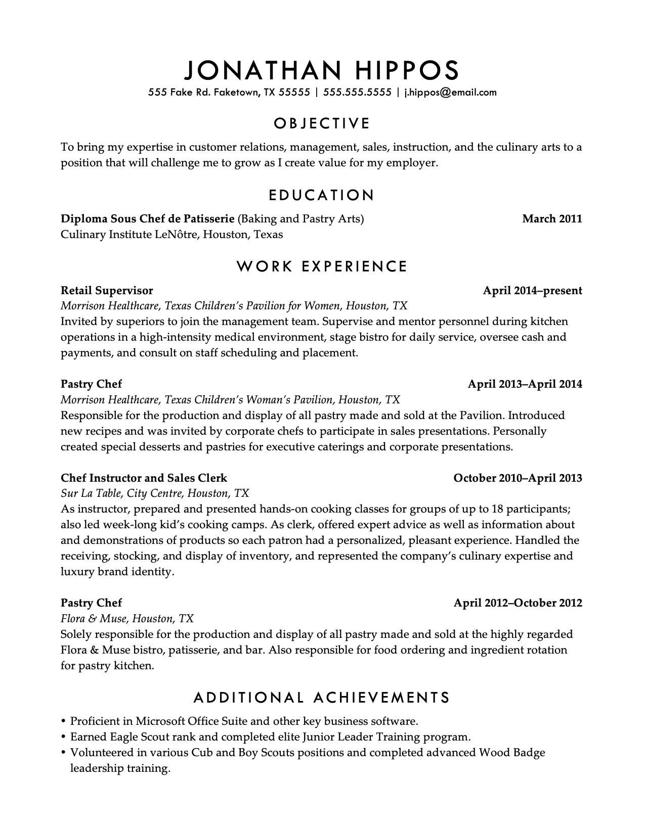
Here are some additional examples of personality through resume typography.
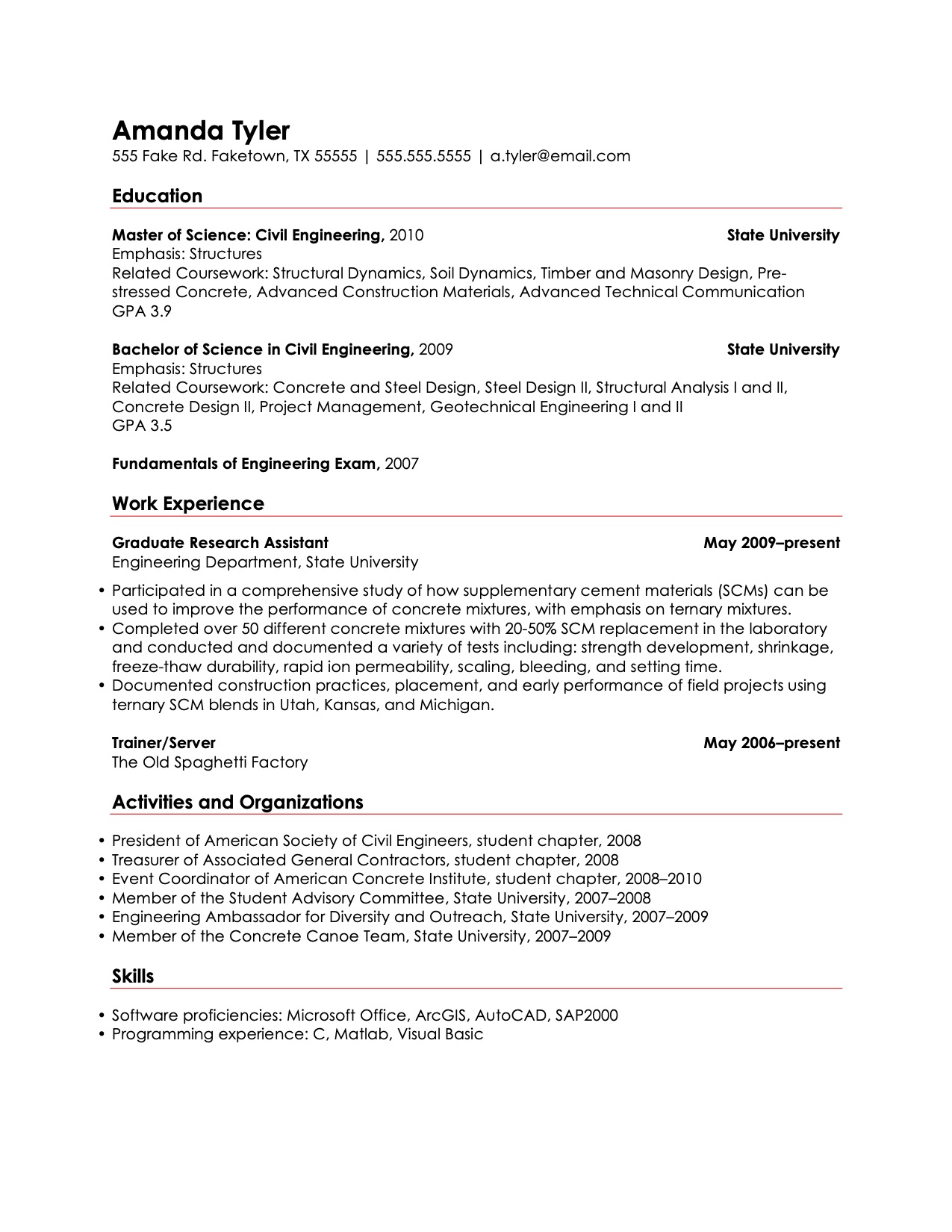
Amanda, an engineer, opts for a single, simple font throughout, which is perhaps indicative of her efficiency at work. She uses only different sizes and weights to indicate the tiers of information, aided by the use of horizontal rules. Using color is a risky choice in such a buttoned-up field, but she was successful finding a job with this resume. (Click to view as PDF)
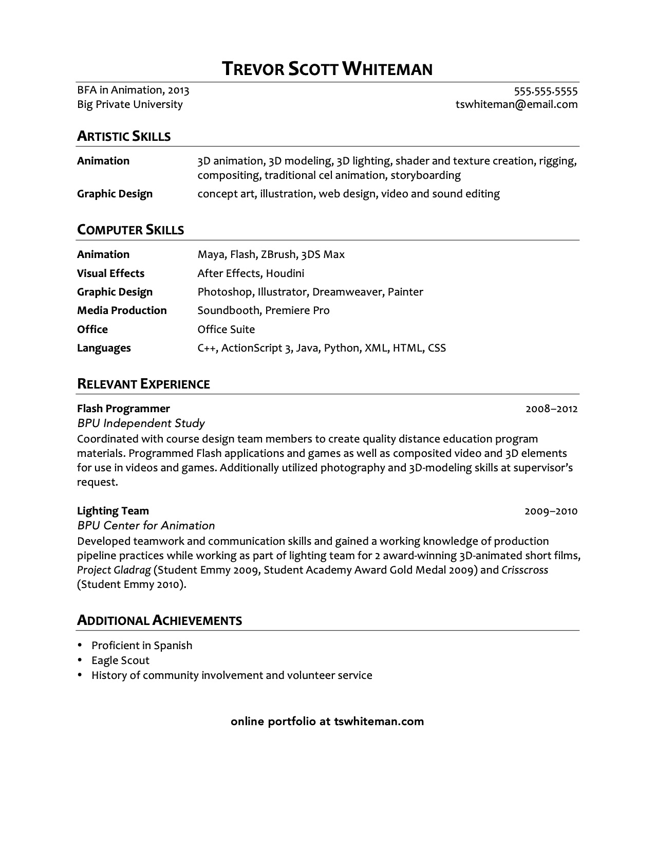
Trevor, a computer animator, uses a single font but distinguishes the headings from the basic text by styling the headings as small caps. He cleverly lays out his extensive technical skillset in the form of tabled lists. There is perhaps too much white space at the bottom; this could've been distributed between sections for a more balanced page. (Click to view as PDF)
Conclusion
If you browse around the internet looking at sample resumes, you'll see a lot of high-concept designs, which, if they don't overwhelm you, might tempt you to use a template or a resume generator to get a slick design of you own. But beware: what looks original to you is likely unoriginal to someone who reviews resumes regularly. They've more than likely encountered the template you chose dozens of times already, so what you saw as a benefit quickly becomes a liability.
Even worse, many of the templates out there fail to accomplish what I've laid out for you here—they may be aesthetically pleasing, having been created by designers, but they don't efficiently guide the reader's eye to the specific must-haves and nice-to-haves that you want your potential employer to see. The only way to do that is to customize any template you find, which takes more work than just designing a simple, clean look from scratch.
