


If you're like me, ninety percent of the slideshows you’ve ever seen were unintelligible hot garbage, the speaker reading each slide word for word and then pausing while elaborate animations play out for no reason, the look on his or her face saying, “Impressed, yes?”

Oh, great. Another one of Chad's "pep talks."
Photo by Austin Distel on Unsplash
No, you were not impressed. You were bored. You wondered why you had to sit through the presentation when you could’ve just read the slides yourself at home. You got confused about the overall logical flow of the presentation—how many ideas did the speaker say they were going to cover at the outset? How many of them have been covered so far? How much longer do I have to suffer through this?
And here’s the kicker: when you make your own slideshows—even though you know full well what sucks about everyone else’s—they suck just as bad.
You too spend an hour choosing the coolest PowerPoint theme, confident that the exact right one of the 20 or so built-in designs and color palettes will win the day and cover up the fact that your presentation isn’t very well thought through. You too cram seven bullet points on each slide, each with a 20-word sentence that you tell yourself you won’t read aloud but inevitably do. You too get drunk watching dozens of sample animations play across your screen and then settle for the gaudiest one, confident it will impress.
Or maybe you’re the one who thinks you’ve outsmarted the rest and you ditch PowerPoint for Keynote, or Google Slides, or Prezi. “Those PowerPoint lovers won’t know what hit them,” you think as you make the same old mistakes despite a bunch of flashy new templates and animations.
Well, friend, consider this an intervention. It’s time to put down the mouse and step away from the slides.
This article will explain to you how to build better slideshows by first discussing the principles that should guide your design and then outlining the process you should follow.
Principles
There’s no point in jumping in to making slides unless we first understand the principles that guide good slide-making. Here they are.
The Golden Rule
As you know, at Grover's English, our mantra never changes: Writing (or, in this case, presenting) is a service to the reader. Our audience’s needs are what guide all of our decisions, and—regardless of the genre conventions and good advice we may find in textbooks—we know we must break with conventions and advice if circumstances demand we do something different to better meet their needs.
Of course, this directive is unhelpfully vague, and I imagine you often find yourself in a situation where either (1) you feel you want to serve the audience’s needs but you don’t know how to do it or (2) you can’t figure out what the audience’s needs are. The remaining principles will try to combat that by being more specific and useful.
Sense Over Flash
Your audience cares much, much less about how cool your slides look than they do about how much sense they make. That’s why I’m so adamant that you follow a process that involves generating content first—for example, by outlining and scripting carefully to make sure what you want to say is well crafted and sensical. The same will go for the process of creating slides—below, I’ll push you to make sense first and worry about formatting later.
Think about movies. Most people would rather watch a movie that makes sense, even if it doesn’t have much in the way of special effects, than they would watch a movie that is visually stunning but is full of terrible plot holes or just weak storytelling. How often have you gotten excited for a movie trailer that was dazzling, only to lament after seeing the actual film that it was just dumb?° On the other hand, who comes home from a tightly plotted thriller that blew their minds and says, “I mean, the plot was incredible, but there just wasn’t enough CGI for me”? No one, that’s who. Low-budget sense beats high-budget nonsense.
None of this is to say that you can’t have both. But the way you get both is to focus on content first. I often talk about this concept with my students under the name of “The Silver Rule of Writing.” The Silver Rule has to do with the relationship between content (what you’re saying) and form (how you’re saying it), and it says, generally speaking:
Content should drive form, not the other way around.
In other words, you don’t just choose a form—a ready-made outline from a textbook or a slideshow template—and force your content to fit by cutting, rearranging, and generally mangling your message to fit the outline or the template. Instead, you alter the template to do justice to the message you have to share.
Say you hit that dropdown on PowerPoint and look for a slide layout that will work for what you have to say, and none of them work? Do you change what you have to say to work with the formatting options available to you, or do you build a new slide layout from scratch to best present your content? The Silver Rule of Writing says you do the latter.
Deliberate Pacing and Design
We have to think about kairos—the time and place in which the audience will encounter the presentation—in order to create appropriately paced and designed slides.
Imagine I have a single script but I am going to use it to produce several iterations of my presentation. One iteration will be me presenting live to a small group in a room with just a large monitor screen mounted to a wall. Another involves me presenting on stage in an auditorium with a very large projector screen, in front of 150 people. Yet another is a classroom full of students, with a whiteboard and standard projector screen. And lastly, I’ll be recording a screencast version that can be uploaded to YouTube and viewed by anyone, anywhere.
Considering these different audiences and settings, you can immediately see that I may need to alter the script to fit the situation. For example, presenting live to a small group or classroom enables me to engage the audience interactively, to ask questions or engage in a discussion. I can’t do that in an auditorium or a screencast (at least not to the same degree).
I also need to alter my slides’ design and pacing to match the scenarios. For example, in an auditorium with a giant screen, I may need to reduce the number of words on my slides and increase the font size to keep things readable for the back row.
Font sizes must change for different screen sizes and audiences at different distances.
Also, since I’ll be doing more of a monologue and less of a discussion there, my slides can be more tightly choreographed to follow my script, but in a classroom or small group I might have more general slides or a changeable slide order, allowing space for audience interaction to guide the direction of the presentation. If I were going to post the slides for my students to read after class, I might include more text on slides—or attach notes to the slides—than I would if I were doing a one-off presentation for strangers.
PowerPoint allows you to add notes to slides, which can be useful when the file itself will be shared with others.
Lastly, for the screencast version, I might include quite a lot more small changes to slides and more animations to counteract the lack of a physical presence to drive interest; I know my YouTube viewers will be bored by even a few seconds on screen without movement, so I cram in more excitement to match.
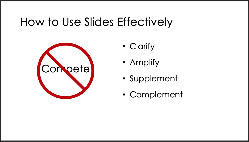
Don’t Compete
The most common mistake I see in presentations is that the slides compete with the speaker. Audiences can’t both read and listen at the same time. If they are listening to you and then a slide pops up with lots of text or a complex image, they have to either ignore the slide and listen to you or ignore you and parse the slide. Forcing the audience to choose between the two is a cruel failure of the Golden Rule.
Think about why we use slides in the first place. I mean, why do we? What is better about a presentation with slides over a presentation with no slides? And don’t tell me the one is exciting and the other is boring—if your spoken element can’t stand alone as interesting and intelligible, then no amount of slides will save your presentation from failure.
No, the reason we use slides is that doing so gives us an additional channel with which to clarify, amplify, supplement, or complement our message. It’s the same reason your textbooks use illustrations and bold key words.
Understanding this relationship between the script and the slides helps us know what to include and leave out of our slides. For example, if I were presenting and my script included the previous paragraph, I might be tempted to put it word-for word on a slide, like this:
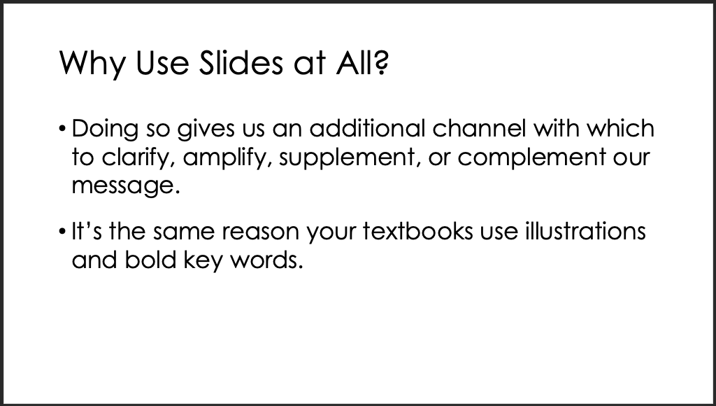
But doing so will force the audience to decide between listening to me or reading the slide, which is what we don’t want. I could read the slide word for word to the audience—but then I’ll become that person who reads slides word for word. You do not want to be that person.
Because I know that the point of the slide is to clarify, amplify, supplement, or complement my message—not to present my message for me—I can feel free to drastically pull back on the number of words I use. Looking at the paragraph, I can quickly see which words are worth using and which aren’t—obviously the most important words are clarify, amplify, supplement, and complement.
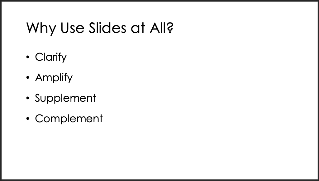
Putting just the key words from a sentence or paragraph on a slide has the same effect as bolding them in text. The reader hears my sentence as it’s spoken, and then they see the key words emphasized visually, drawing their attention to the part of the sentence I want them to focus on.
Or I could use a slide like this:
Here I use a visual comparison between what I don’t want (competition) and what I do want. This amplifies the comparison, making sure the reader notices the one the one hand/on the other hand type of logic I’m using.
Another approach could supplement or complement the concept spoken in words, this time using an image that appears as I speak the sentences—in this case, maybe a picture of a Christmas tree with way too many lights on it or a cake with too much icing could visually make my point.
I need to be careful with this approach because, if the image is complex or the metaphor it creates difficult to parse, the audience will stop listening to me while they process the information. Still, it can be an effective way of adding a dimension of meaning without wasting a lot of words.
Highlight Transitions and Organization
Another way you can use slides to complement the presentation is to use them to signal transitions from one main section to the next or to clue the audience in to the organization of the presentation.
When you write for a reader, you can use paragraph breaks, subheadings, topic sentences, and the like to signal the organization of your essay or memo or whatever. A reader can visually see how the text is broken up on the page, and if they get lost or confused, they can reread to find the lost logic. With an oral presentation, however, the audience can’t see the text, so there are no paragraph breaks and headings to help them—it’s easy for the audience to lose the logic of the presentation’s organization, and there’s usually no way to rewind the presentation to find it again.°
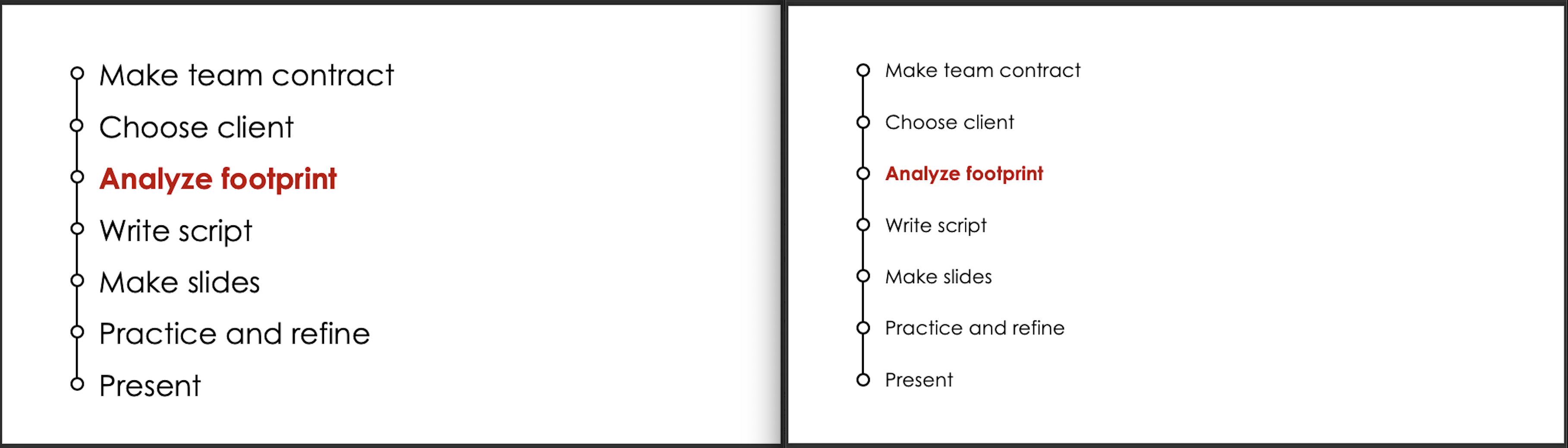
Therefore, signaling transitions with slides can be very useful for the audience. It’s not uncommon to see a slide toward the beginning of a presentation lay out the main topics in order and then “section header” slides throughout indicate when the presentation reaches those topics. And it’s often a good idea to have a title show up consistently on a number of slides in a row so that the viewer sees the connection between them.
You can also signal logical connections by using similar layouts, fonts, colors, and other formatting elements. For example, in a long presentation with several major sections, each section could have its own unique color scheme to give the audience a (mostly) subconscious sense of change from one section to another.
These techniques aren’t always necessary. In fact, shorter presentation or those with more organic or narrative structures only become tedious with too much signposting.
Don’t Overload the Audience with Information
Sometimes you do need to use a lot of text or a complex image on a slide, but when you do, do everything in your power to limit how much you present at once.
- Eliminate unnecessary words if at all possible.
- Use animations so that only a few words or a part of the overall image appear at a time.
- Highlight the relevant parts of the slide as they are discussed to direct the audience’s attention to that part of the slide.
- Alter the script so that the complex slide is explained in advance.°
- Have the presenter stop speaking long enough to allow the audience time to process the slide.
Favor Images Over Text
That's it. That's all. If you can use an image instead of words, you should almost always do it. Your presentation will already be chock full or words coming out of your mouth, so even using few words on slides has a tendency to compete rather than complement. But images can give shape to your words, can show spatial relationships between concepts, can illustrate how your words apply to real life.
Process
Now that you have an idea of the principles that should guide your design decisions, let’s discuss the process you might follow to actually build a slideshow. In this article we’ll focus on the planning part of the process, and in "Making Good Slides" we’ll look at actually building the slides.
Step 1: Read and Mark Script
Okay, I’m assuming here that you’ve written a script or at least a very detailed outline. If you didn’t, well, what are you expecting here? There’s no shortcut to greatness. Go back and write a script, alright?
Once I’ve got a script together, I read through it aloud and mark as I go the places I think I’ll need a slide. Reading aloud gives me a sense of the pacing, so I can immediately see if I’m gonna have too many quick changes over too few sentences or if there’s a long paragraph with no change in slide. I can make quick alterations to the script to smooth things out, and I might note in the margin what a particular slide could contain if I have a really good idea off the top of my head.
I also get a sense of the tone of the script—is it funny, slick, serious, wry, or what?—and can therefore start to see what the tone of my slides will need to be to match.
If I’m working from a printed script, I just put a star next to the word or phrase where I think a new slide should happen. If I’m working from a script on screen, I usually type several asterisks in the spot, like this: *****.
Step 2: Storyboard
Having got my script marked, the next step is to storyboard out what I think my slides will look like. I do this on paper for the simple reason that I can always get a pen to produce what’s in my head, but I get slowed down trying to do so with a computer, and I don’t want any friction.
Also, I want to be free to really think about how my slides can best serve my script, and if I’m already in PowerPoint looking at templates, color schemes, and layouts, then I’m setting myself up to put form before content, which is breaking the Silver Rule.
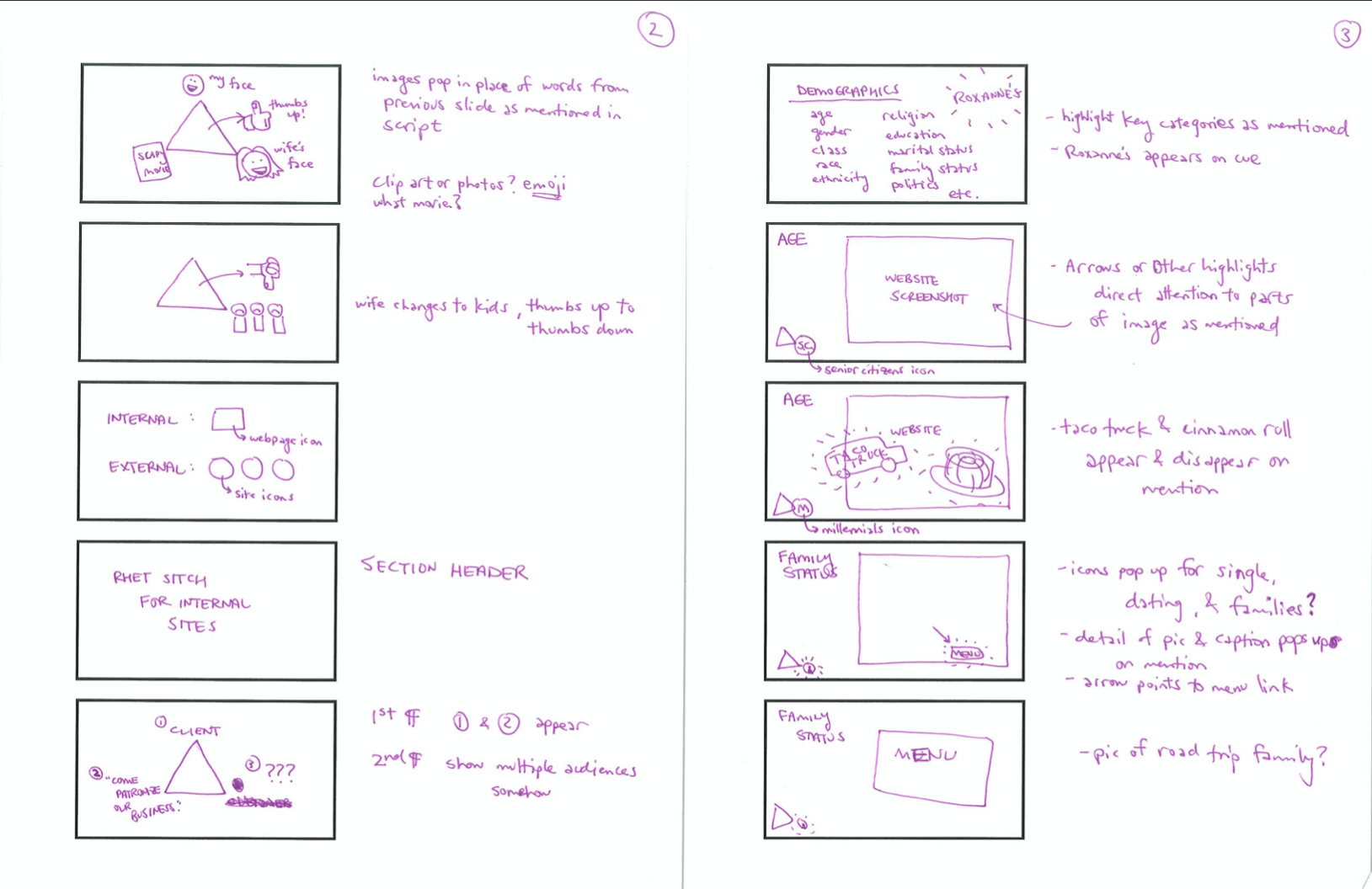
Two pages of storyboards for the "Analyzing Digital Presence" video (Click to enlarge)
The storyboards don’t need to be detailed or beautiful—they just need to capture your impression of the order of the slides, the words and images each slide might contain, and any notions of how they might be animated in the case that not everything will show up at once.°
One benefit of storyboarding before building is that it can save you time in the long run. What? Save you time by adding another step, you ask? That’s right. When we jump right into making slides, we have a tendency to focus only on the slide in front of us and lose sight of the whole show. Many times I’ve found myself tweaking an early slide for 40 minutes before realizing that (1) the slide is part of the intro and isn’t even crucial to the meat of the presentation, (2) the slides will only be on-screen for 4 or 5 seconds—or worse, will get cut when I make revisions to the script—and (3) I have another 25 slides to make, all of which are more important than this one.
By storyboarding in advance, you can pretend to create an elaborate slide in a few seconds and then move on, coming back later to decide whether making the slide is really worth it or a simplified version will do. Example: The third slide on the right of the storyboard above was planned to visually make fun of millennials and their love of taco truck authenticity, but in the end I decided to ditch the joke, which would’ve required me to surf Google Images for another 20 minutes to find just the right image for a 1-second gag. I also ditched the last two slides.
Step 3: Check Timing
Once I have my storyboards, my last step of planning is to read the script aloud one more time and use the storyboards to imagine the slideshow running in real time. Based on my findings, I might tweak the script (maybe lengthening a sentence to allow a slide to stay up longer or reorganizing paragraphs to better build a transition) or I might tweak the slides (simplifying, usually—I always overdesign).
We talked above about keeping kairos in mind when designing slides. Here’s some rules of thumb:
- When giving a live presentation, generally plan for slide changes to happen every 10 seconds or more. Your physical presence in the room will be the main animation, so too-frequent changes on the slides becomes distracting and frenetic looking. On top of that, tightly choreographed changes mean you have to all but memorize your script and give it word for word, lest the animations get away from you.
- When performing a screencast, you generally want slide changes to happen every 5 seconds or less. With no physical presence to watch—just a disembodied voice to listen to—the audience will quickly start looking around their desk or screen for something to distract them. The changes don’t have to be completely new slides; they can be small animations to existing slides, new words or images appearing, or highlights or movement to draw the viewers’ attention to key bits of the slide.
Conclusion
Let me say it once again: the key to a good slideshow is in the planning, not in the software you choose or the fonts or animations. Audiences want sensical information presented in a logical way. They need slides to be the signposts noting the turns taken in the presentation's route from start to finish.
Get that right, and the audience won't care if its black text on a white background. Get that wrong, and no amount of pictures, memes, visual puns, and swirly animations will save you.
