


In "Web Documents Require Structure" we learned that, in addition to content and formatting, we also need to give our documents structure—that is, we need to formally designate what type of text each part of the text is. We can designate some parts as paragraphs, others as headings or lists, and so on.
In "Chunking Info for Readability" we learned how help readers more efficiently navigate our writing by using chunking techniques, many of which involve these same types of structural elements.
This article, then, picks up where those two left off. It presents the most common structural elements used in HTML (and in the lightweight markup language Markdown) and explains how and why each one can be used to create webtexts that accommodate the reading patterns typically adopted by internet users.
To be clear, this isn't a technical tutorial on how to write in HTML. It's meant instead as a general resource. For those who are primarily writers, it offers a glimpse at the underlying HTML so that they can better understand how protocols and expectations might influence how they should structure webtexts. For those who are primarily web designers or coders, it offers a glimpse into how writers think about texts in reader-focused ways.
Here are the elements that will be discussed below:
Paragraphs
Paragraphs are the basic unit of structure for a web document, and they are exactly the same as paragraphs used in any other document. To be clear, a paragraph is a block of text of any length and separated structurally from any text that comes before or after. A new paragraph is traditionally signaled visually by by either an indented first line or by white space between it and the preceding paragraph, like this white space dividing this paragraph from the next one.
We usually break our text into paragraphs to give our readers subtle signals about how the logic of our writing is moving. For example, the previous paragraph's purpose was to define what a paragraph is, and the purpose of this paragraph is to explain what a paragraph means. The paragraph break itself was a signal to you that these two paragraphs have different purposes. Had I formatted all this text as a single long paragraph, that would've implied to you that I saw these two purposes as being more closely connected (or even as being part of the same thing).
Using Paragraphs Effectively
Reading on a screen is generally more difficult and tiring than reading on paper, and studies have shown that readers tend to adopt a skimming or scanning pattern when reading webtexts—especially when faced with large blocks of text. Therefore, a good rule of thumb for writing on the web is to break your paragraphs much more often than you would for print.
See, in this new paragraph, I'm going to explain what I meant by that last line. If I were writing for print, I would probably not have broken the paragraph there, because explaining an idea in further detail isn't really a strong enough shift in topic that I feel a paragraph break is necessary or preferable. However, to save your eyes and accommodate readers' more fickle attention spans online, I broke it there.
Sometimes I'll even do a very short paragraph.
In print, such a short paragraph might seem almost like a slap in the face, or a throwing down of the gauntlet, but online, it just adds verve and vigor to the writing while keeping the text readable and preventing the page from having a plodding, all-paragraphs-the-same-length feel. Pay careful attention to your paragraphing when you write online, because this is your most basic and most useful structuring technique.
Headings
If you think of paragraphs as the roads that a reader travels down, then headings are the street signs that reveal the names of the roads and signal where to turn. Headings are blocks of text that structurally divide a text up into sections and subsections. While they can be of any length, they are typically short phrases or single words.
In HTML, there are six available levels of headings, which we call H1, H2, H3, H4, H5, and H6. The idea is that these levels create an informational hierarchy in the document in the same way that the levels of a formal outline do. H1 is like the Roman numerals-level of an outline, H2 like the capital letters-level, h3 like the Arabic numerals-level, and so on.
- Level 1 Heading
- Level 2 Heading
- Level 3 Heading
- Level 4 Heading
- Level 5 Heading
So actually, the road sign metaphor used above is inaccurate, because street signs are all at the same level of the hierarchy, while different levels of headings are not at the same level. It may help to think of them more like levels of specificity in a physical address, such as this one for the Nelson Atkins Museum of Art:
- United States of America
- Missouri
- Kansas City
- Oak St.
- 4525°
Using Headings Effectively
Headings reveal the logical structure of a webtext in a highly visible way, making them a great tool for accommodating online readers' reduced attention spans. In writing for print, you might rely more on paragraph breaks, topic sentences, and transitions to more subtly indicate the logical flow from one topic to the next; however, in webtexts we tend to be more overt about structure by using headings liberally.
That said, here are two quick rules of thumb to guide you in choosing how many levels of headings to use and how frequently to employ them:
- Use headings more frequently and employ more levels when you expect readers to read with a skimming approach—either an F-pattern, spotted pattern, or layer-cake pattern.° For example, a page of reference information or of complex instructions serve readers best when headings divide and subdivide the page to help readers quickly navigate to the specific information they need.
- Use headings less frequently and employ fewer levels when you expect readers to adopt a commitment pattern, reading the webtext top to bottom. For example, a narrative blog post about someone's beach vacation need not be endlessly divided and subdivided—in fact, overdoing it with headings on such a page can actually deter or derail readers by breaking their focus.
One more guideline for effective headings is that lower levels of headings can generally be longer. H1s and H2s tend to be most effective when they are only a few words long at most, but as you get into H3s, H4s, and so on, headings may become longer, even reaching the length of full sentences in some cases.
Using Headings Correctly
Here are two important rules to follow when using headings.
Headings must be introduced in order and not skipped.
The first heading used on any webpage must be an H1. Similarly, you cannot skip from, say, H1 to H3 without first introducing an H2 on the page.
Why, you ask? Because doing so breaks the structural logic that headings are meant to create, the same way that jumping straight from Roman numerals to lowercase letters would in a formal outline or jumping straight from state to street (skipping the city) in an address would.
Headed sections must be nested hierarchically.
Any section headed with an H2 must be contained within a section headed with an H1, any H3 section must be contained within an H2 section, and so on.
Take this article as an example. You are currently reading a section headed by the H4 "Headed sections must be nested hierarchically." This section is contained within the H3 section "Using Headings Correctly," which in turn is contained within the H2 section "Headings," which is in turn contained within the H1 section "Structural Elements for the Web."°
- Structural Elements for the Web
- Headings
- Using Headings Correctly
- Headed sections must be nested hierarchically
The fact that this section and the previous one, "Headings must be introduced in order and not skipped" are both H4s appearing within the same H3 section indicates to the reader that both sections are of the same level of depth or specificity, logically speaking—they are the two rules the H3 section promised to present:
- Using Headings Correctly
- Headings must be introduced in order and not skipped
- Headed sections must be nested hierarchically
If "Headed sections must be nested hierarchically" was an H5 instead of an H4, the reader would consider it to be a subsection (not a parallel section) of "Headings must be introduced in order and not skipped" and would expect the second promised rule to show up further down the page.
- Using Headings Correctly
- Headings must be introduced in order and not skipped
- Headed sections must be nested hierarchically
- Rule #2
Lists
A list is structural block quite similar to a paragraph, except that instead of designating the text as a linear flow of sentences, a list designates that text as a set of items of some equivalent type or kind. For example, here is a list of groceries I need to buy:
- milk
- bread
- eggs
- apples
Rather than arrange the items in the list as one long line, as a paragraph does, the default presentation for a list is in a column, with one item per row. This arrangement gives the reader a clear visual cue that the items are all of a type, and it makes it easy to see at a glance about how many items there are.
For online readers with tired eyes and short attention spans, lists are an effective chunking technique that aid in quick comprehension and navigation, and they serve to add visual interest and diversity so that readers don't feel they are being bombarded with an endless wall of text.
Using Lists Correctly
There are two kinds of lists in HTML: ordered (that is, numbered) and unordered (that is, bulleted). It's important to choose the appropriate type for the list you are making:
- An ordered list's numerical sequence implies to the reader that the order of the items on the list is an essential aspect of the information being presented. Think of the steps in a recipe's procedure—you can't flip a pancake before you make the batter.
- An unordered list's lack of numbers implies to the reader that the order of the items is not inherently important. Consider the grocery list above—it doesn't matter what order you find these items in the store so long as you have them all when you get home.°
Using Lists Effectively
Here are three tips for using lists effectively.
List what can be listed
Generally speaking, when writing for the web, you should use a list whenever you have listable content (within reason). For example, instead of this—
The Beatles recorded 13 albums: Please Please Me, With the Beatles, A Hard Day's Night, Beatles for Sale, Help!, Rubber Soul, Revolver, Sgt. Pepper's Lonely Hearts Club Band, Magical Mystery Tour, The Beatles (aka "The White Album"), Yellow Submarine, Abbey Road, and Let It Be.
—it's much better to do this:
The Beatles recorded 13 albums:
- Please Please Me
- With the Beatles
- A Hard Day's Night
- Beatles for Sale
- Help!
- Rubber Soul
- Revolver
- Sgt. Pepper's Lonely Hearts Club Band
- Magical Mystery Tour
- The Beatles (aka "The White Album")
- Yellow Submarine
- Abbey Road
- Let It Be
But beware: you can overdo it with lists too. Treat them like images or block quotes: used in moderation, they provide readability and visual interest. Used too frequently, they make your writing choppy and frenetic.
Keep items equivalent
The various items in your list should all be grammatically and logically equivalent. For example, if the items on your list are all simple nouns or noun phrases, it would be weird to include an entire sentence as an item:
First date ideas:
- movie
- dinner
- moonlit walk
- Whatever you do, don't take your date to a family reunion!
- board games
Similarly, the items in your list should all be of the same relative length and specificity—the sample you just read shows how weird and unbalanced it feels when one list item is significantly longer or shorter than the others.
Use bold with longer list items
A great trick when dealing with longer or more complex list items is to use bold to give each item a quickly scannable intro, as in this example from "Chunking Info for Readability":
We are adopting three key values to guide future projects:
- Trust: Training will be provided to help team leaders develop more trust between team members as well as between members and leadership.
- Accountability: A new reporting system is being developed to ensure the anonymity of whistleblowers.
- Snacks: The budget for refreshments is being tripled.
Be mindful that, even with a technique like this, you shouldn't let list items get too long, lest the list itself lose its meaning. (A good rule of thumb is that the entire list should be visible to the reader without scrolling in an average sized window.) If you find yourself tempted to make each list item as beefy as a paragraph—or even multiple paragraphs—it is almost always more effective to promote your list into a section with list items as subsections, using headings and paragraphs to create this structure.°
Blockquotes
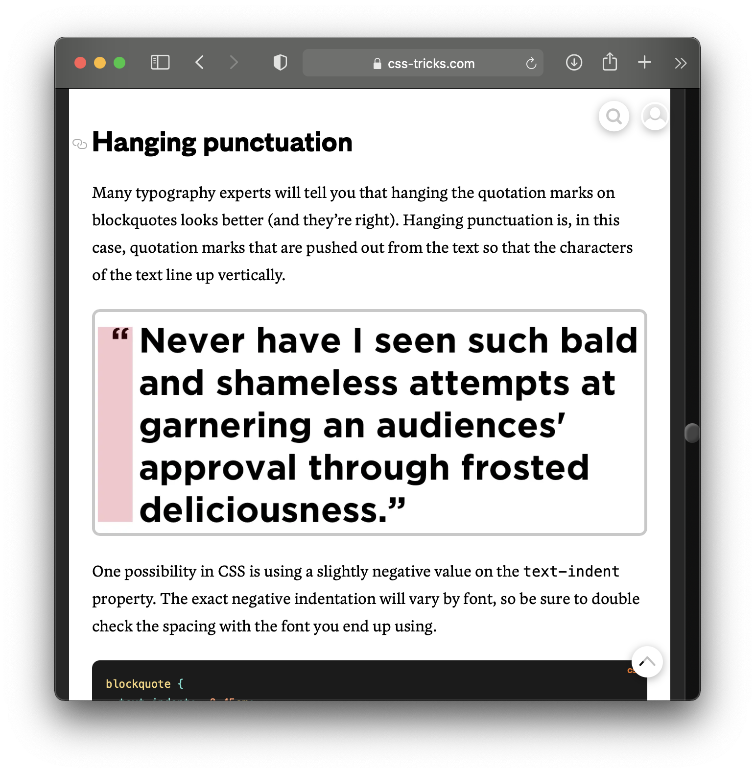
In print, quoted material is usually designated with quotation marks and included right within a paragraph. However, when the quoted material is quite long (40 words or more, usually), we place the quotation outside the paragraph as its own "block" of text—we call this a "block quote."
Part of the reason for this is that the longer a quotation goes on, the more worried the reader gets that they missed the closing quotation mark and the more distracted they become in looking for it. The block quote, then, is a typographic courtesy that makes consuming long quoted material more comfortable for the reader, since they can plainly see where the quote begins and ends.
The HTML element called <blockquote> is a structural element that achieves this same thing for webtext. A blockquote is a block of text, like a paragraph, but its use indicates to the reader that the text has been borrowed from somewhere else.°
Using Blockquotes Effectively
It's pretty straightforward: Use blockquotes when you want to designate a block of text as borrowed from elsewhere.
As with lists, blockquotes can be an effective way to add visual interest, to chunk the text, and to draw the reader's eye to a particular spot on screen. But just as in print text, they should be used sparingly lest they lose their appeal or chop up your text too aggressively. The same structural separation that makes them visible makes it easy for a reader to skip over them.
Note: Traditionally, you don't need to put quotation marks around a block quote because the formatting of the quote as a standalone block of text already tells the reader that the material is quoted.
Structure v. Formatting
Remember that, as a structural element, blockquote doesn't include any particular formatting information. It's up to the web designer of a site to indicate how blockquotes should be styled, so you'll see lots of different approaches around the web—some more obtrusive, some less so. For example, here on Grover's English, we give blockquotes a soft gray background, a fat purple border on the left, and a big indent, and we change the font from a serif font to a sans serif font:°
Grover's English is the best website on the entire internet.
—Darth Vader
Here's a more dramatic formatting technique for blockquotes:
When writing for a particular site, keep in mind how blockquotes are styled and let that inform how and how often you use them.
Emphasis and Strong
We sometimes want to draw attention to single words or phrases in our writing. The most common ways of doing this as we write print texts are to designate text with the emphasis or strong HTML elements ()<em> and <strong>, respectively). Unlike many of the elements we've discussed above, emphasis and strong are not standalone elements but instead are applied to text that is already part of a paragraph or list.
Be careful, though: emphasis and strong are not the same things as italics and bold. Italics and bold are formatting; emphasis and strong are structure. Overwhelmingly, websites will render em text in italics and strong text in bold; however, there's actually no guarantee that that formatting will be associated with those elements—web designers are free to apply any formatting they choose to <em> and <strong>.°
Using Strong Effectively
Because <strong> generally results in text that is bold, it is best to use it to draw the reader's eye to text you want them to see and that would otherwise tend to disappear in the sea of text around it. Consider this paragraph from above:
There are two kinds of lists in HTML: ordered (that is, numbered) and unordered (that is, bulleted). It's important to choose the appropriate type for the list you are making.
I used <strong> to ensure that you, the reader, noticed those two key technical terms. If later on you were quickly scanning back through the article looking for key points you may have missed or forgotten, these two bolded words, and others like them, would be likely to draw your eye even when moving fast.
Using Emphasis Effectively
Unlike <strong>, emphasis does not tend to draw the reader's eye—italicized text actually tends to disappear from a scanning eye. For this reason, it's best to use <em> as an indicator of special meaning. Consider these sentences:
I told you not to go!
I told you not to go!
I told you not to go!
Where the emphasis is placed changes the way you read the sentence in your head and implies a different meaning. The first version sounds like the speaker is saying a version of "I told you so," while the second one is clarifying to whom the order was given.
A Few More Tips
In formal or academic writing, we generally use bold quite sparingly (if at all), and we only use italics for specifically defined situations (such as the titles of works of art or the use of foreign terminology). On the web, however, things tend to be much more informal and conversation, so you can get away with using emphasis and strong more liberally.
As with other elements, however, if you use them too often or frivolously, readers stop paying attention to them.
Conclusion
HTML offers many other elements that can contribute to defining a webtext's structure and ensuring its readability, but these are by far the most common, and they are generally the ones you'll have available to you if you write for the web using Markdown or a text-editing interface such as those provided on blogging sites, wikis, and website generators.
As you practice using these structuring elements and readability-enhancing techniques, you'll likely find that they help you think more strategically about all the writing you do, not just for the web.
